Nolan in Gotham
Typography Only Posters
In 2015, after we had finally closed the doors on our motion design studio effort and chose again to focus all of our abilities on graphic design, one of the first exercises was designing posters for our favorite Stanley Kubrick movies using only the typeface Futura. It was Kubrick’s personal favorite and he used it for every film following 2001: A Space Odyssey. The resulting project was shared via several design blogs.
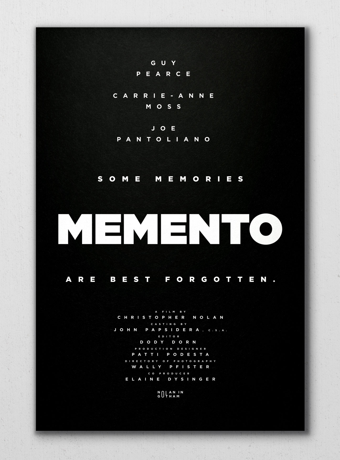
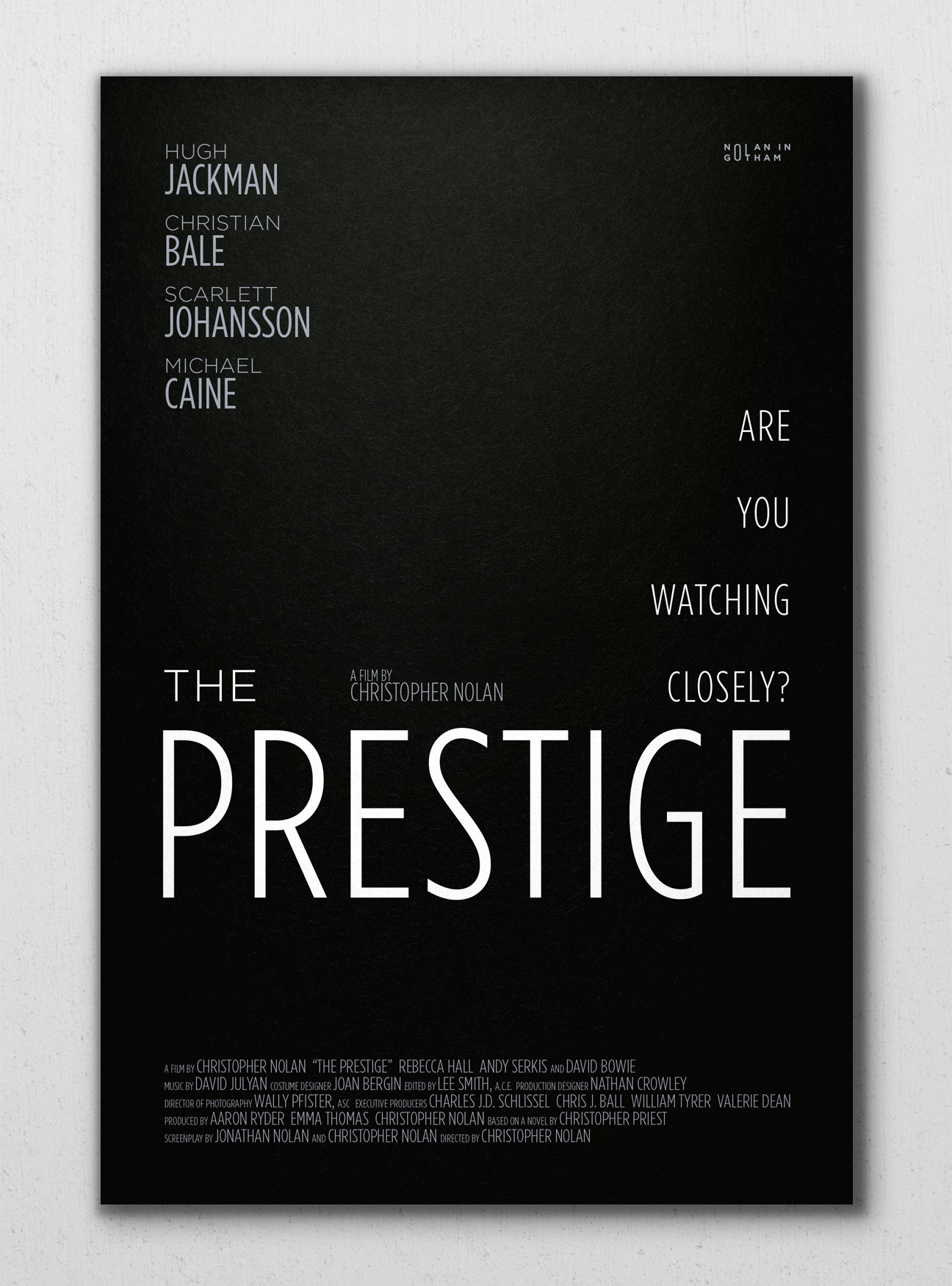
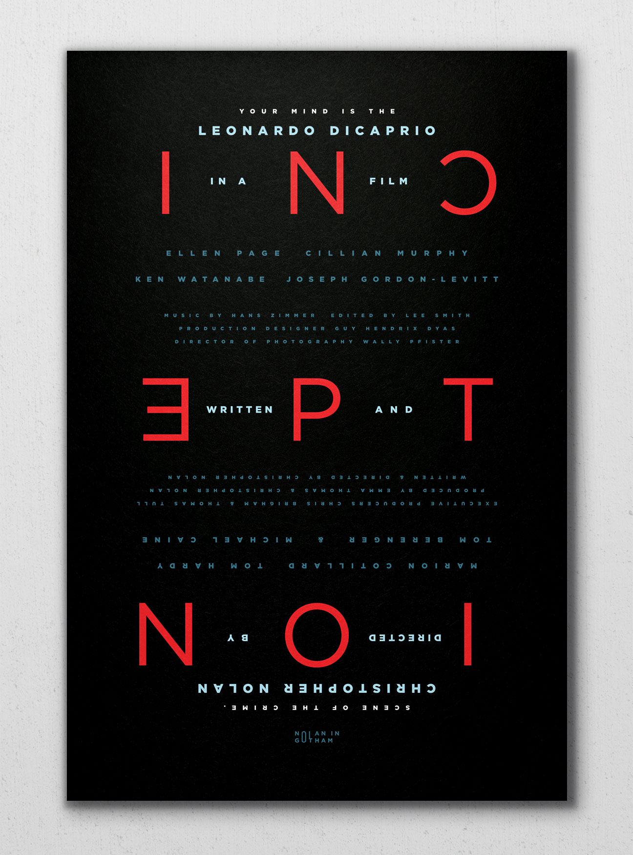
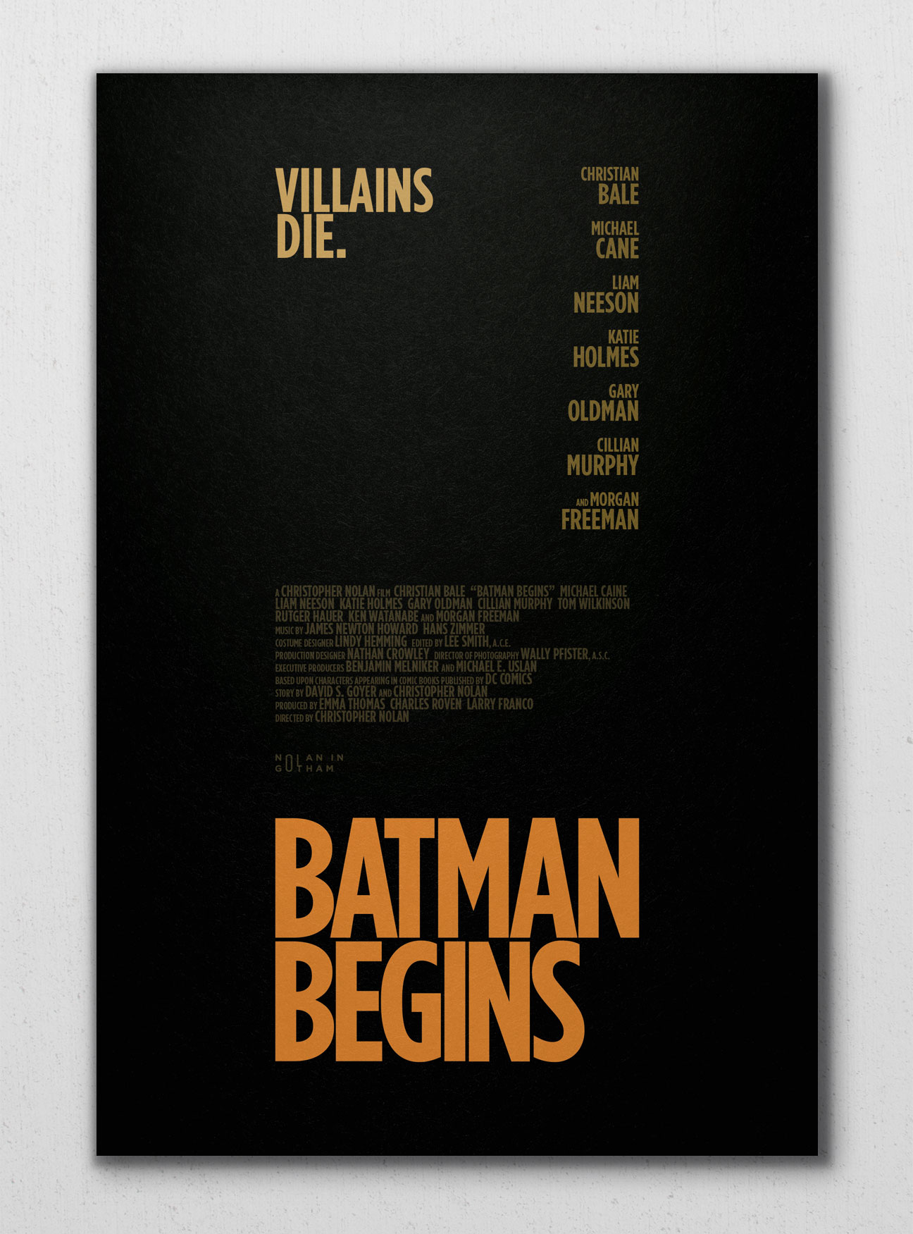
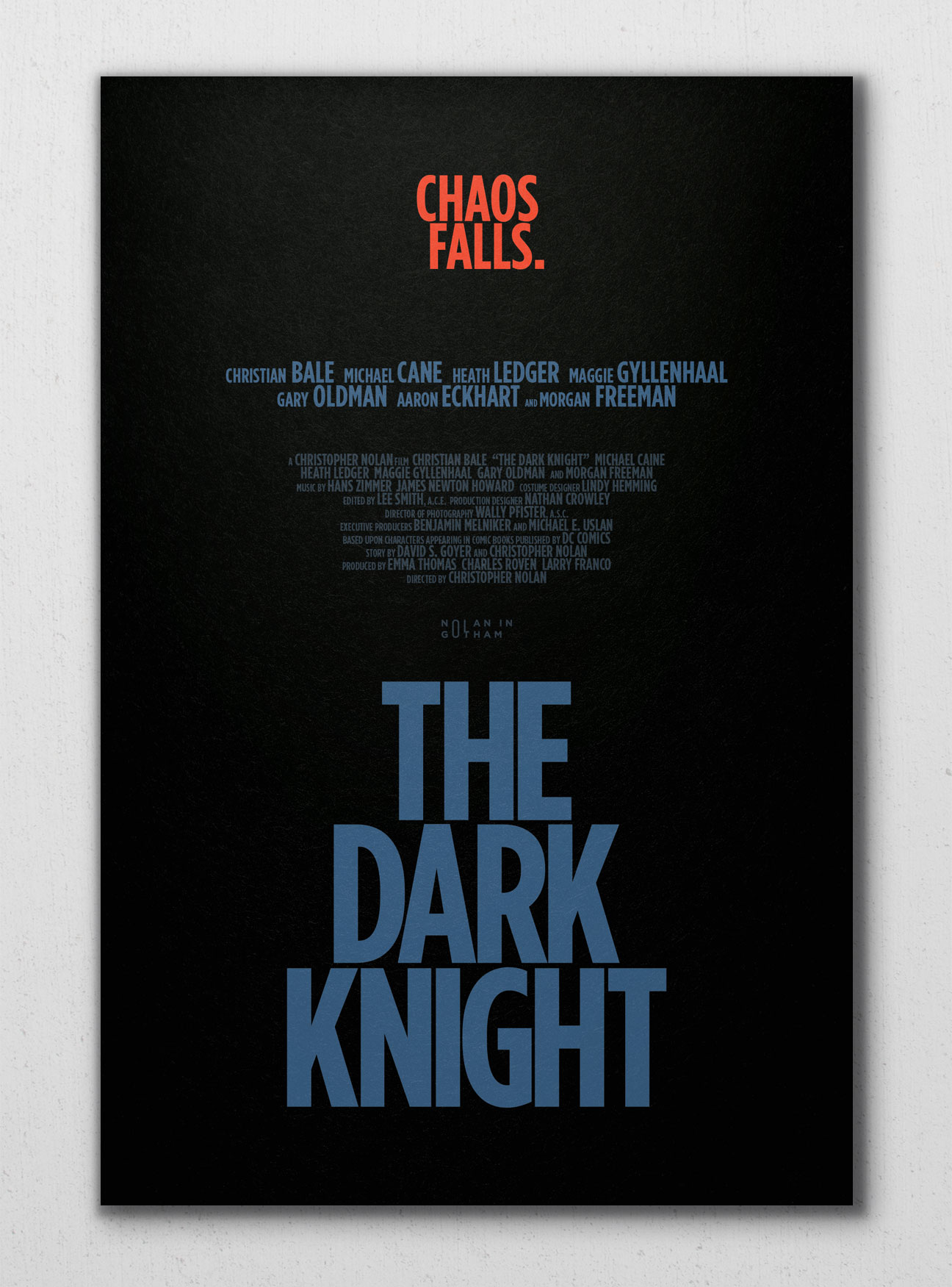
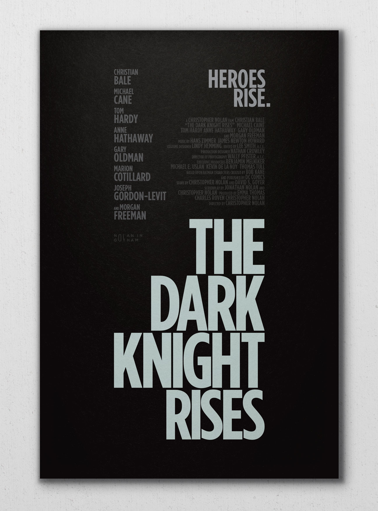
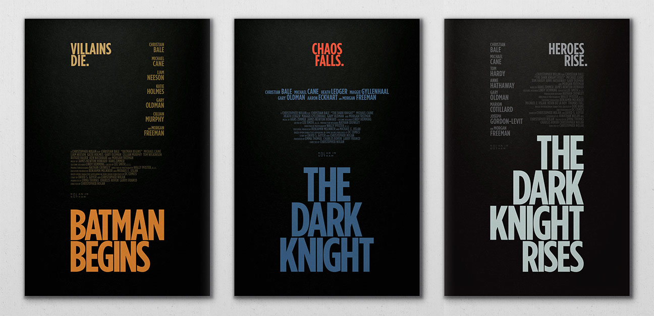
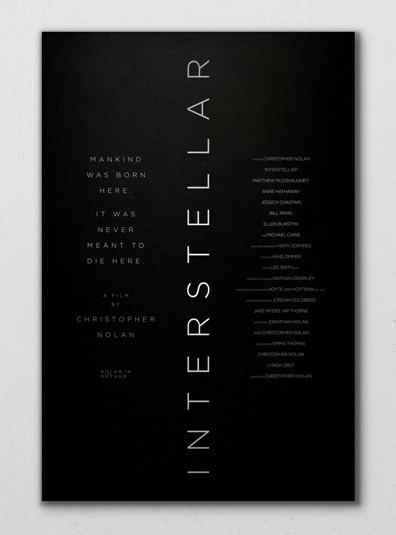
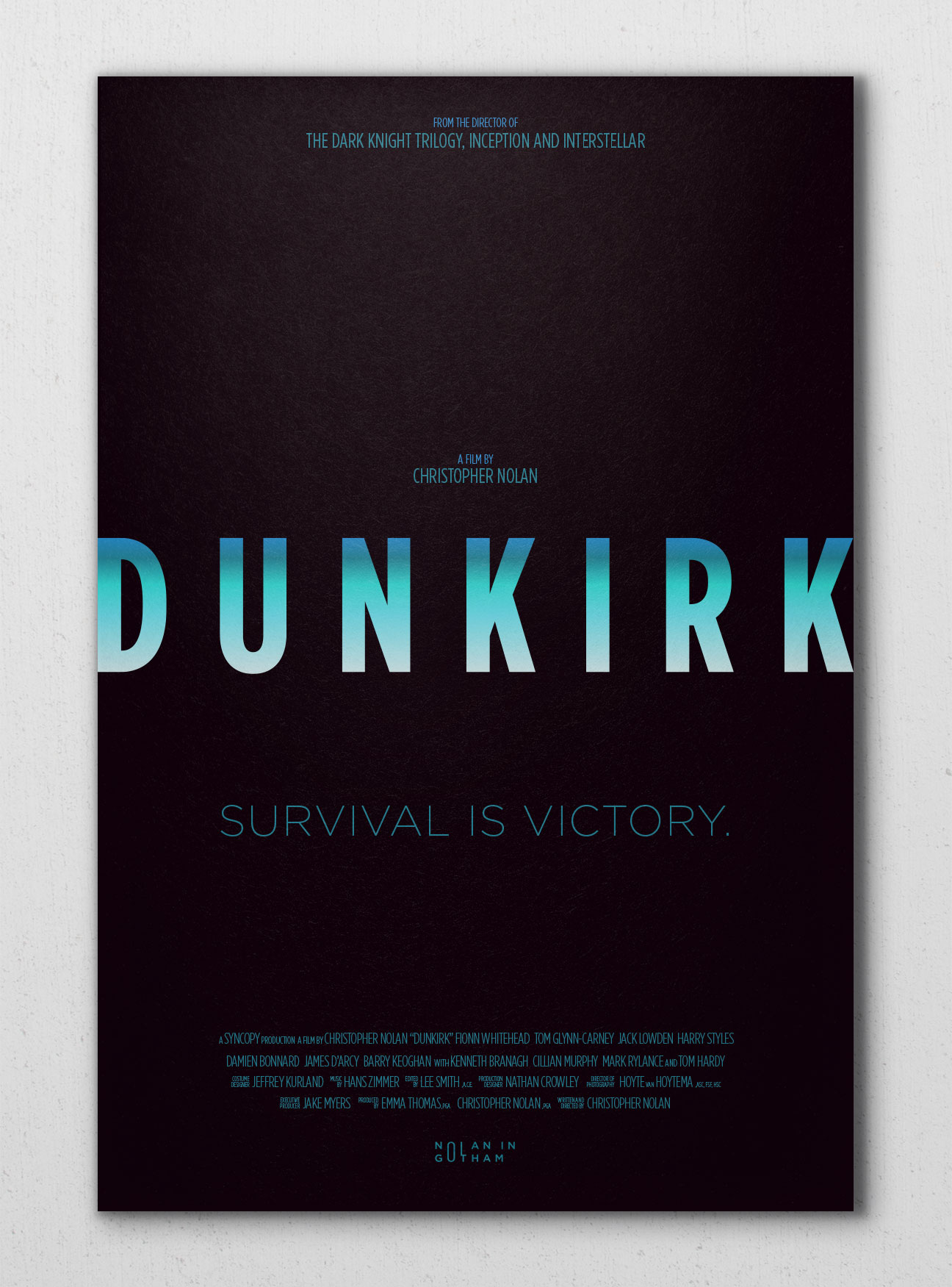
We realized we might be onto something and wanted to take a crack at doing a similar project for another our favorite directors, Christopher Nolan. But the question was which typeface best fit Nolan’s iconic trendsetting yet old fashioned style of filmmaking? We settled on the iconic and fairly recently created yet timeless typeface Gotham by the incredible foundry Hoefler & Company. The font had been on CTT founder Christopher Cox’s radar since 2008 when he helped develop print collateral promoting the campaign of soon-to-be president Barack Obama. Since then it has become an absolute staple for much of Change The Thought’s branding work. It offers up a rare blend of old meets new with a retro-metropolitan meets futurism humanist sensibility.
This seemed like a perfect match for Nolan’s iconic movies, so we created the ‘Nolan in Gotham’ project to again help refresh and cement the love for both typography and film. The attempt was the same as the ‘Kubrick in Futura’ project and this was to represent the distinct personality of each film using only the single font family without the support of any imagery.